Want to improve your web design and development skills? Check out Bapu Graphics! Our course on responsive web design is perfect for anyone who wants to learn the latest techniques and best practices for creating beautiful, easy-to-use websites, regardless of their level of skill. Our knowledgeable instructors will guide you through every phase of the process, from building wireframes and prototypes to implementing responsive design principles and making your site ready for search engines. You’ll also have access to a wealth of resources, including tutorials, guides, live customer support, and more. Take our course now to start designing modern, mobile-optimized websites that your clients will love!
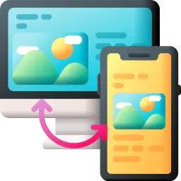
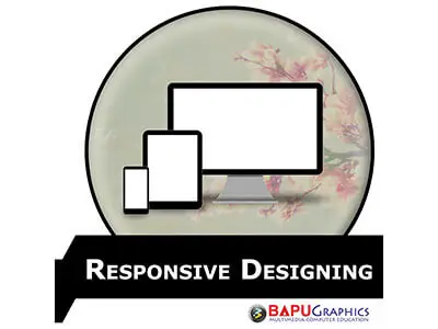
Technology is constantly evolving, so keeping up with the latest trends in web design is essential. This is why responsive web design courses are so popular. But what exactly is responsive web design? Responsive web design (RWD) is an approach to web design that makes web pages render well on a variety of devices and screen sizes. RWD is one of the most important trends in web design, and every web designer should be familiar with it.
In this course, we’ll give you an overview of responsive web design, including what it is, why it’s important, and how you can use it to create beautiful, responsive websites.
If you’re interested in learning how to create responsive websites, this course is for you!
There are a number of reasons why responsive web design is important. Most importantly, it makes your website more accessible to a wider audience. This is because a responsive design will adjust to the various screen sizes and resolutions that people use when accessing the internet.
Furthermore, a responsive web design can improve your search engine optimization in addition to making your site more accessible. Your website will be easily indexed by search engines, which will result in increased traffic.
Finally, a responsive web design can enhance your website’s user experience. Users will be able to easily navigate your website, as well as view all of the content that you have to offer.
Responsive web design offers many other benefits, but these are some of the most important. If you are looking to improve your website, then responsive design is definitely something that you should consider.
The course provides students with valuable insights into the user experience aside from learning how to code for responsive web design. To stay competitive in today’s digital world, businesses must put the user first, and the responsive web design course provides students with the tools to do just that.
These are just a few of the ways in which the course can benefit students:
There are a few options available to students after they complete a Responsive Web Design course. They can either find a job as web designers or pursue a placement in a related field. Alternatively, they can continue their studies by completing a higher-level course or becoming a web developer.
Bapu Graphics runs its own placement cell and till now more than 500 companies are tied up with us. Students get jobs through our placement cell immediately after doing the course or during the course, There are many Jobs options after doing a Responsive Web Design course from Bapu Graphics.
Answer: Responsive web design (RWD) is a web development approach that creates dynamic changes to the appearance of a website, depending on the screen size and orientation of the device being used to view it.
Answer: Almost every business depends on having its presence on the world wide web. Individuals who complete the course and can create responsive websites have lots of scope after successfully completing this course.
Answer: Responsive design can help you solve a lot of problems for your website. It will make your site mobile-friendly, improve the way it looks on devices with both large and small screens, and increase the amount of time that visitors spend on your site. It can also help you improve your rankings in search engines.
Answer: Your audience will access your website from a variety of different devices in all shapes and sizes, Easier to monitor analytics, Easier to maintain, Boost for SEO, Consistency in design and brand, Lower bounce ratesImproved conversion rates.
Enroll Now and Expand Your Knowledge! Register for Our Exciting Course Selection Today!
At Bapu Graphics, we specialize in providing top-notch training in web designing, graphics designing, digital marketing, animation, video editing, and much more. Our expert faculty members are industry professionals, ensuring that our students receive the highest quality education and practical insights into their chosen fields.
H-17 / 263, First Floor, Sector 7, Rohini
Near Rohini West Metro Station
Opposite Metro Pillar No. 425
Rohini, Delhi – 110085
Ansal Sushant City, Kundli,
Distt. Sonipat, Haryana, India
Near Panipat, Karnal
© Bapugraphics. All Rights Reserved
WhatsApp us
